Histogram is a statistical graph used to show the collective data as a set of rectangles. In this tutorial, I will show you how to create a histogram in Microsoft Excel. If you have a large data set and would like to see the distribution of the data with respect to one or more variables, a histogram can be useful. One benefit of a histogram is that it depicts the shape of the data set.
If you are trapped in a data trapped and don’t where to go, you need Excel Histogram Chart. Creating histogram chart will enable you to make better conclusions on your collected data.
How to Create a Histogram in Excel

By Stephen L. Nelson, E. C. Nelson
In Excel, you can use the Histogram Data Analysis tool to create a frequency distribution and, optionally, a histogram chart. A frequency distribution shows just how values in a data set are distributed across categories. A histogram shows the same information in a cute little column chart. Here’s an example of how all this works — everything will become clearer if you’re currently confused.
To use the Histogram tool, you first need to identify the bins (categories) that you want to use to create a frequency distribution. The histogram plots out how many times your data falls into each of these categories.
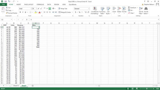
This worksheet shows bins information in the worksheet range E1:E12. The bins information shows Excel exactly what bins (categories) you want to use to categorize the unit sales data. The bins information shown in the worksheet range E1:E12, for example, create hundred-unit bins: 0-100, 101-200, 201-300, and so on.

To create a frequency distribution and a histogram, follow these steps:
- Click the Data tab’s Data Analysis command button to tell Excel that you want to create a frequency distribution and a histogram.
- When Excel displays the Data Analysis dialog box, select Histogram from the Analysis Tools list and click OK.
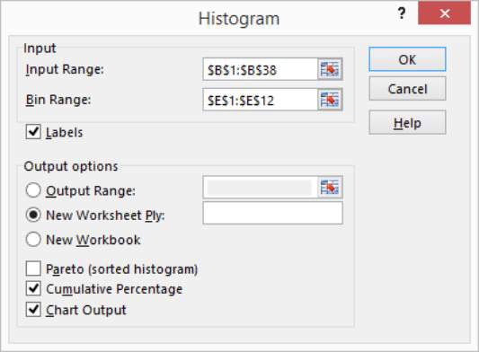
- In the Histogram dialog box that appears, identify the data that you want to analyze.Use the Input Range text box to identify the data that you want to use to create a frequency distribution and histogram. If you want to create a frequency distribution and histogram of unit sales data, for example, enter the worksheet range $B$1:$B$38 into the Input Range text box.
 To identify the bins that you use for the frequency distribution and histogram, enter the worksheet range that holds the bins into the Bin Range text box. In the case of the example worksheet, the bin range is $E$1:$E$12.If your data ranges include labels, select the Labels check box.
 - Tell Excel where to place the frequency distribution and histogram.Use the Output Options buttons to tell Excel where it should place the frequency distribution and histogram. To place the histogram in the current worksheet, for example, select the Output Range radio button and then enter the range address into its corresponding Output Range text box.To place the frequency distribution and histogram in a new worksheet, select the New Worksheet Ply radio button. Then, optionally, enter a name for the worksheet into the New Worksheet Ply text box. To place the frequency distribution and histogram information in a new workbook, select the New Workbook radio button.
- (Optional) Customize the histogram.Make choices from the Output Options check boxes to control what sort of histogram Excel creates. For example, select the Pareto (Sorted Histogram) check box, and Excel sorts bins in descending order. Conversely, if you don’t want bins sorted in descending order, leave the Pareto (Sorted Histogram) check box clear.Selecting the Cumulative Percentage check box tells Excel to plot a line showing cumulative percentages in your histogram.Optionally, select the Chart Output check box to have Excel include a histogram chart with the frequency distribution. If you don’t select this check box, you don’t get the histogram — only the frequency distribution.
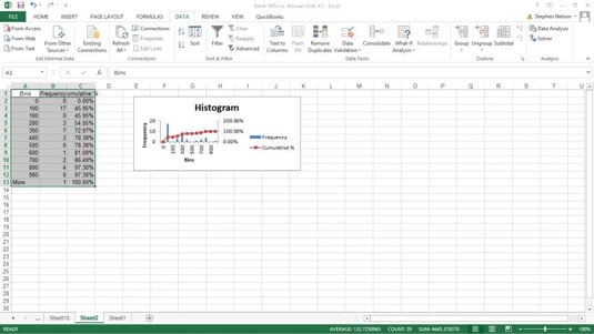
- Click OK.Excel creates the frequency distribution and, optionally, the histogram. Here is the frequency distribution along with a histogram for the example workbook data.

Note: Excel also provides a Frequency function with which you use can use arrays to create a frequency distribution.
How to Create a Histogram in Excel 2007/2010: Steps
Step 1: Enter your data into a single column. For example, you might have a list of IQ scores (118, 123, 124, 125, 127, 128, 129, 130, 130, 133, 136, 138, 141, 142, 149, 150, 154). Enter those scores in cells A2 to A18.
Step 2: Enter your lowest value into the second cell of the next column. This is the start of your first bin. In our example, we put the values in column A, so we need to put 118 (the lowest value) into cell B2.
Step 3: Enter the rest of the minimum data values for your bins into the same column from Step 2. If you’re not sure how to calculate these values, see this article on how to create a frequency distribution table.
Step 4: Click on the “Data” tab and then choose “Data Analysis.” If you don’t have the Data Analysis button, you need to add the ToolPak (it only takes a few seconds). See this how to on how to load the Microsoft Excel Data Analysis ToolPak for instructions.
Step 5: Click on “Histogram” and then click on “OK.”
Step 6: Click on the cell icon to the right of “Input Data.”
Step 7: Click on the first value in the column of data (in this example, that’s cell A2). Hold down the shift key, and then click the last cell in that column with a value (in this example, that’s cell A18). Press the “Enter” key.
Step 8: Click on the cell icon to the left of “Bin Range.”
Step 9: Repeat Step 7, only this time, input your first and last bin values (those are the minimum data values).
Step 10:Click on “Chart Output.”
Step 11:Press “OK.”
Tip: To make the histogram bars touch each other, right click and choose “Format Data Series.” Move the “Gap Width” toggle bar to “No gap” and then click “Close.”
That’s it!
Check out our YouTube channel for more stats help and tips!
Conclusions
Histograms are examples of statistical graphics, which are charts that visually represent numerical data. Histograms are used to show the relationship between different numerical variables.
Histograms are an excellent time series forecasting tool. The term “time series” comes from statistics and represents important stuff, like the how much money is spent by consumers on electricity per month or how many people are born per year.

 To identify the bins that you use for the frequency distribution and histogram, enter the worksheet range that holds the bins into the Bin Range text box. In the case of the example worksheet, the bin range is $E$1:$E$12.If your data ranges include labels, select the Labels check box.